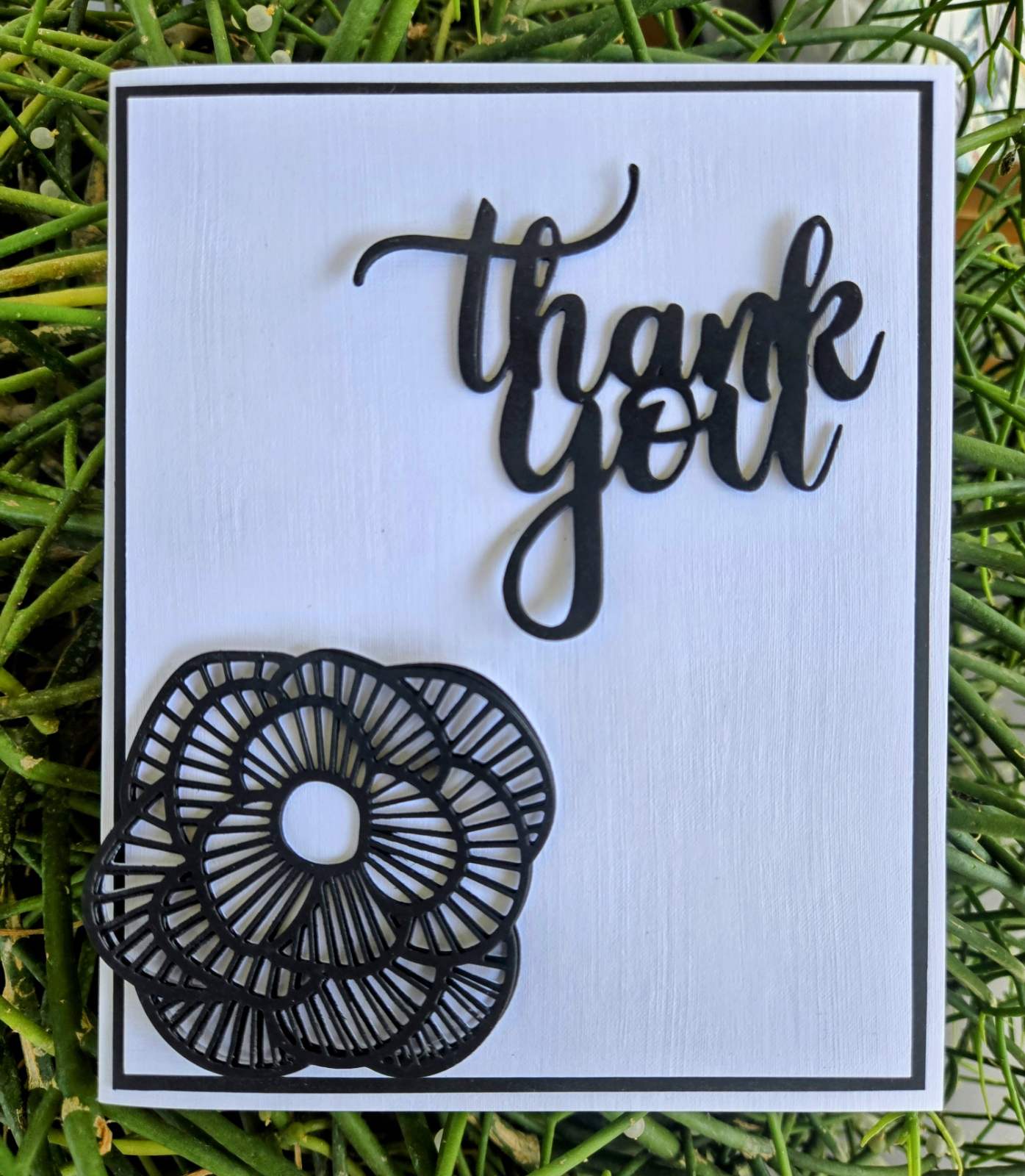
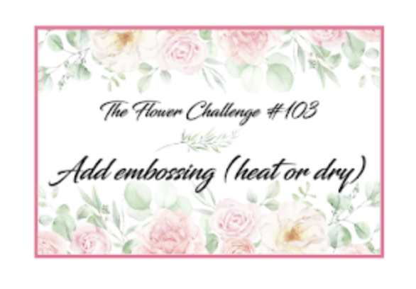
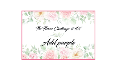
Welcome Back! It’s halfway through the month, and you still have plenty of time to join in the fun at The Flower Challenge. We would love to see you use the colour purple on your crafty blooms.
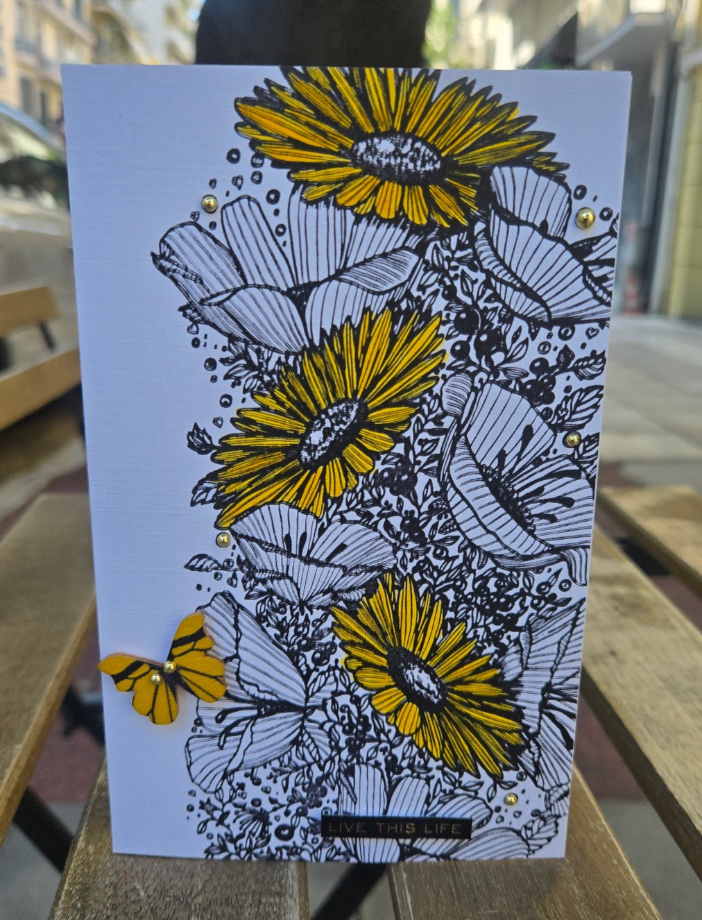
Whilst I was away in the UK, I had time to “splash the cash” and treat myself to all manner of crafty goods; it’s difficult to get the supplies I need(want) here in Greece, so I took full advantage. Needless to say, I ended up with more crafting supplies in my suitcase than clothes.

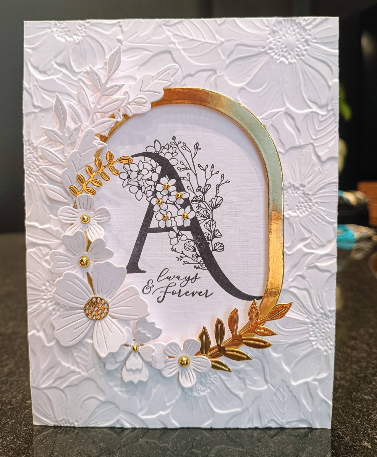
If ever I’m stuck for inspiration or want to find out what’s the latest in crafting items, I always turn to the talented and fabulous Michele from I Card Everyone. I unashamedly (there was a bit of shame) “cased” her beautiful card, which you can see if you follow the link.
The frame is from The Greetery, and the basket and blooms are courtesy of Honey Bee, coloured with distress oxides.
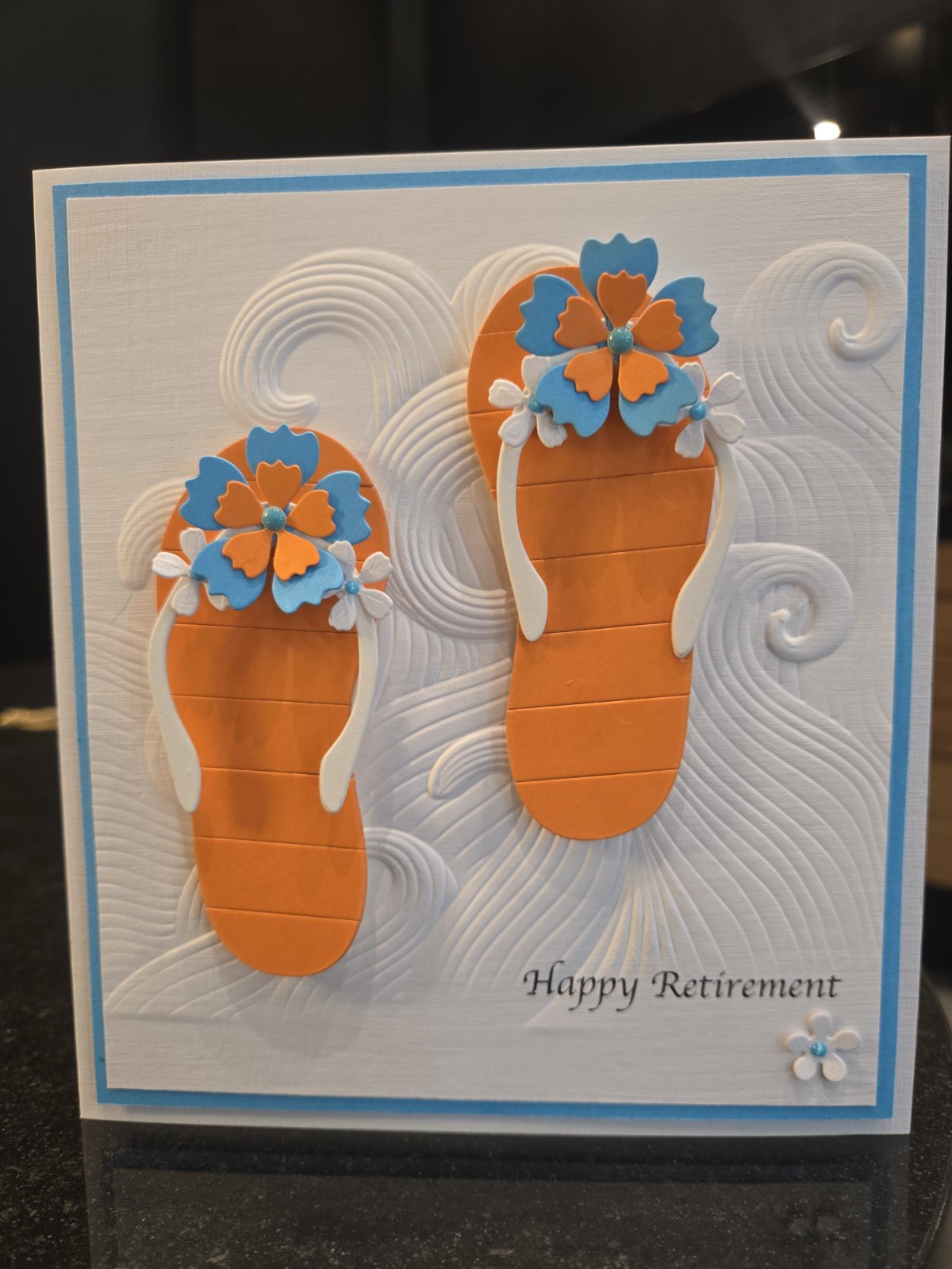
We do hope you will join us at The Flower Challenge. My teamies have once again outdone themselves and created some amazing cards to inspire and delight.
Wishing you all a fabulous day
Marie